
As a member of the Science, Technology Assessment, and Analytics (STAA) team of the U.S. Government Accountability Office, I have the privilege of working with a highly skilled and talented team of experts across all manner of fields to help give Congress information they need to make forward-thinking decisions. It is a duty that I do not hold lightly; I try to remember each day that what I am doing can have a positive impact on the lives of my family, friends, and people of our country.
My time with STAA has been marked by work on innovative projects meant to communicate our valuable work more effectively and accessibly in the climate of the Information Age we live in today. It has also been marked by bridge-building within our agency to work towards common goals, strengthening individual teams as I work to help visualize large amounts of quantitative data or complex qualitative information, and improving our outreach and increasing our reach to audiences.
Below, you will find just a selection of my representative work.
Innovative Work
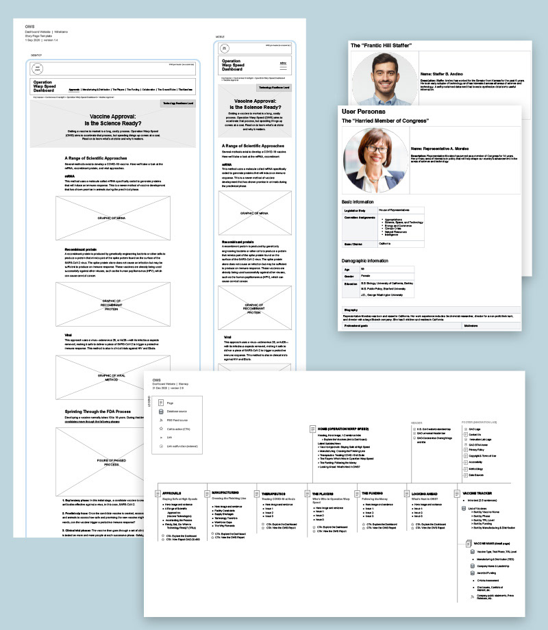
Operation Warp Speed Dashboard
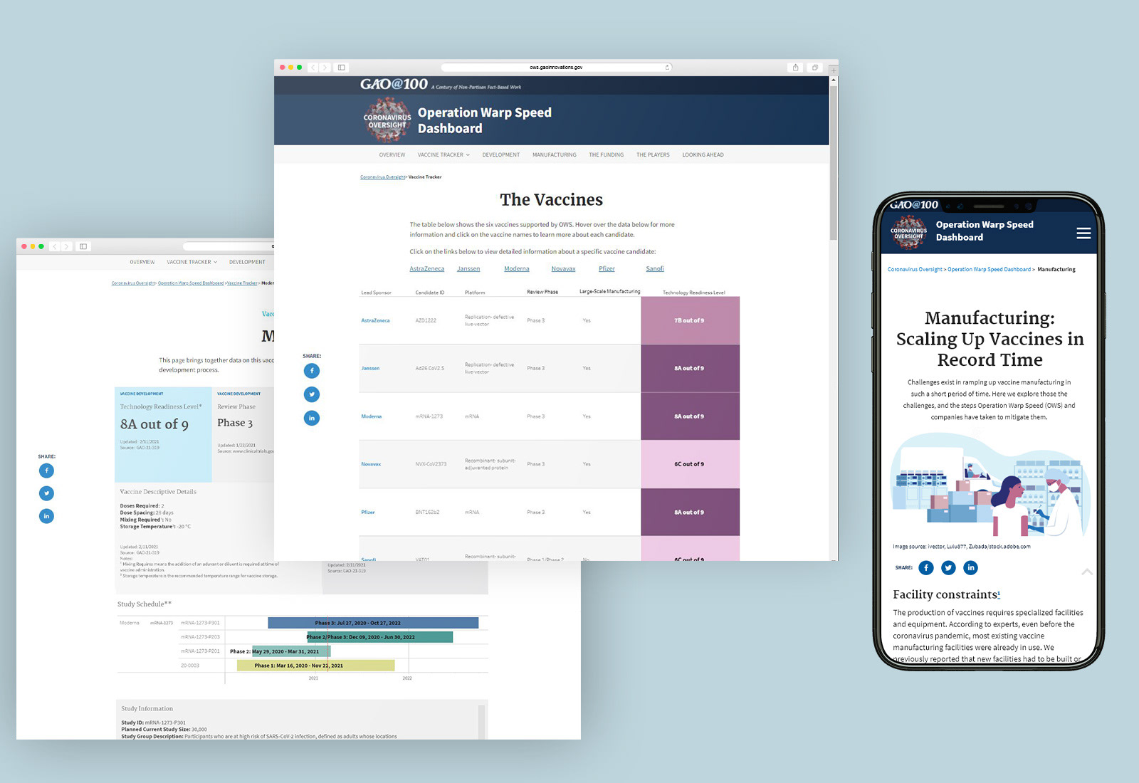
I had the privilege of working on a first-of-its kind web-based dashboard for our agency. This dashboard and website was developed in conjunction with our work with Operation Warp Speed and would be public-facing. It involved much collaboration and work across several mission and support team; a true joint effort.
I was responsible for: developing the sitemap, wireframes, and all designs and design elements for the dashboards and website. In addition, I performed all the front-end development (CSS/HTML/JavaScript), coordinating work with a back-end developer. And I also designed and implemented the data dashboards in Tableau, working with our data scientist who architected the structure and flow of data from clinicaltrials.gov.
The project was a success and received a great deal of positive feedback from our Congressional clients. I had the rare opportunity to demo the dashboard website and answer questions at a committee hearing with our clients. I received a GAO Results through Teamwork Award from the agency because of our work.
The now decommissioned website can be visited here.
A snapshot of some of the groundwork involved in developing the dashboard website (right). This included developing a sitemap, information architecture, wireframes for desktop and mobile views, and developing user personas to help with design/UX/UI decisions.
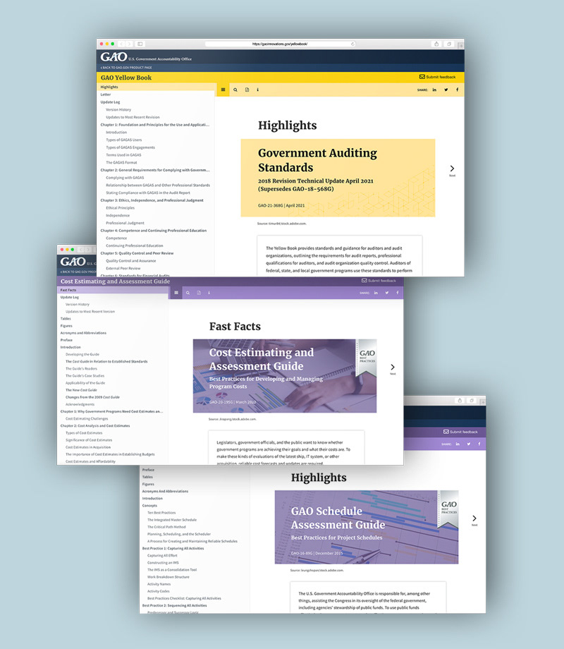
Digital Yellow Book, Cost Guide, and Schedule Guide
In another first, I was involved in helping our agency implement web-based versions of our highly regarded Yellow Book, Cost Guide, and Schedule Guide. It was also a first in terms of taking an application through a full project development process.
My work involved taking the underlying solution developed by our Innovation Lab and making these three digital guides suitable 'for market'.
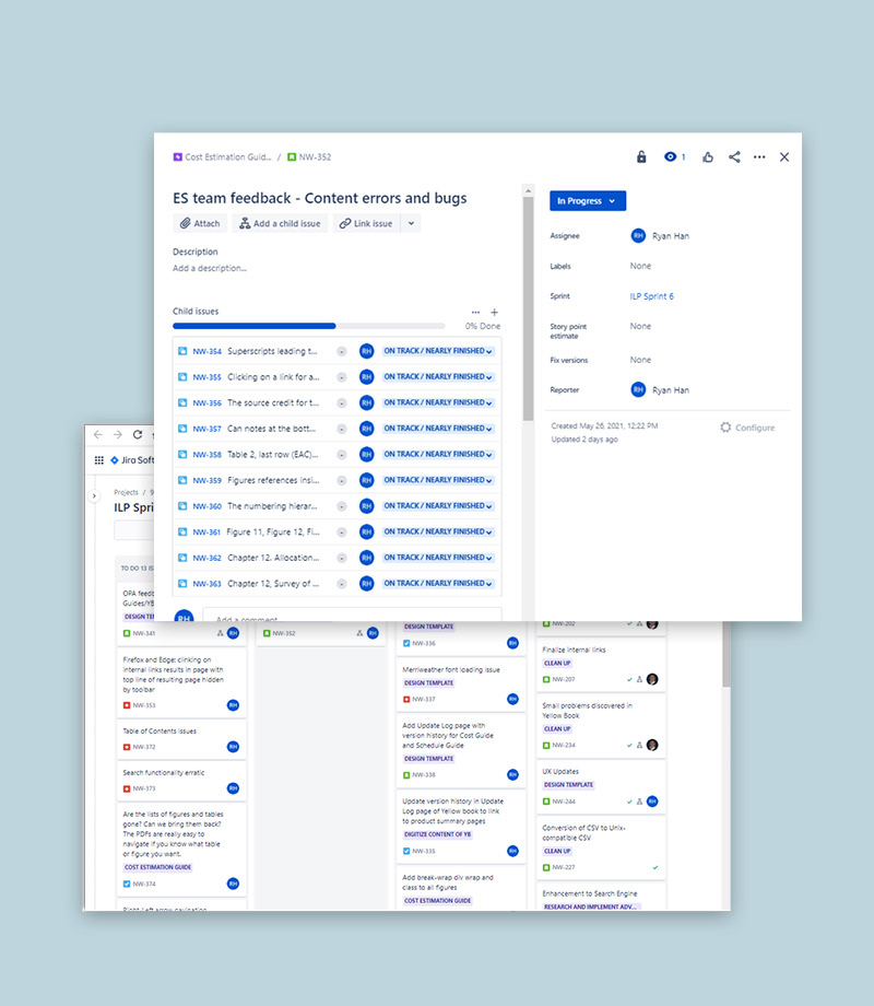
My involvement was comprehensive in that it involved: UX/UI design, functionality and feature design and testing, requirements gathering, front-end coding (CSS/HTML/JavaScript), extensive user-testing and debugging, developing a deployment plan and method for tracking updates, and project management.
Probably one of the most challenging tasks was managing the many stakeholder interests involved. I ran bi-weekly meetings to coordinate input and decisions between all the various mission and support teams involved and/or arranged numerous individual meetings with directors of these teams. I also conducted the extensive user-testing required across these teams, while coordinating with the Lab and our full-stack developer.
I received a Managing Director's Award and GAO Customer Service Award for this work, "building camaraderie across multiple mission teams and support offices, and improving GAO's policies and practices for HTML publishing".
Digital Yellow Book: https://gaoinnovations.gov/yellowbook/
Digital Cost Guide: https://gaoinnovations.gov/cost-guide/
Digital Schedule Guide: https://gaoinnovations.gov/schedule-guide/
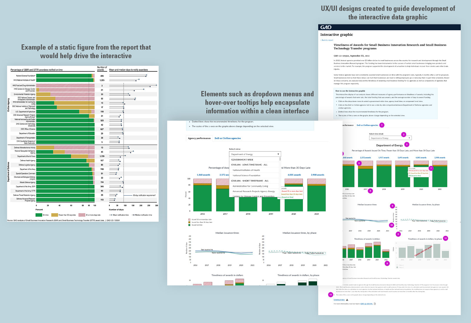
Interactive Data Visualizations
One of my joys is getting the chance to work with teams across our agency. I had the pleasure of working with our Applied Research and Methods (ARM) team on an interactive data visualization that accompanied one of our reports.
This was another rarity, as we were able to realize an interactive outside of the normal agency process, using the resources within our team. This new process was a great byproduct of this project. We are also able to utilize a new JavaScript library - Plotly - which has since been used several other times.
In addition to developing static data figures for the report, I was able to collaborate with our stakeholder partners in ARM to develop an interactive. My responsibilities involved UX/UI design and guidance as well as front-end work in HTML/CSS/JavaScript.
Outreach and More
STAA Annual Update
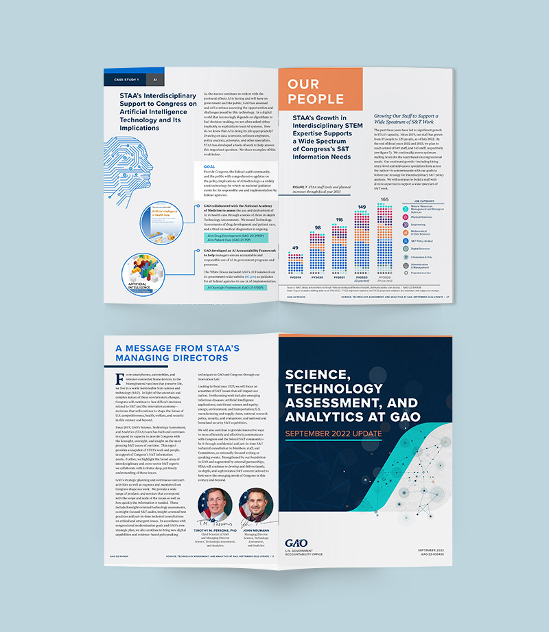
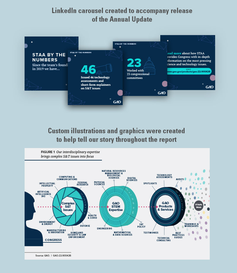
I had the pleasure of helping design and layout our team's first ever annual report, which we ultimately titled the "STAA Annual Update". My work involved taking the content and message of the report and creating a design/layout that would reflect the caliber of talent, accomplishments, and vision of our team.
This involved wireframing layouts with the team, developing custom illustrations and diagrams, and helping with the content strategy of the report.
I also created collateral - such as a LinkedIn carousel - to help promote the report once it was released. We did this all within about 2-2.5 months!
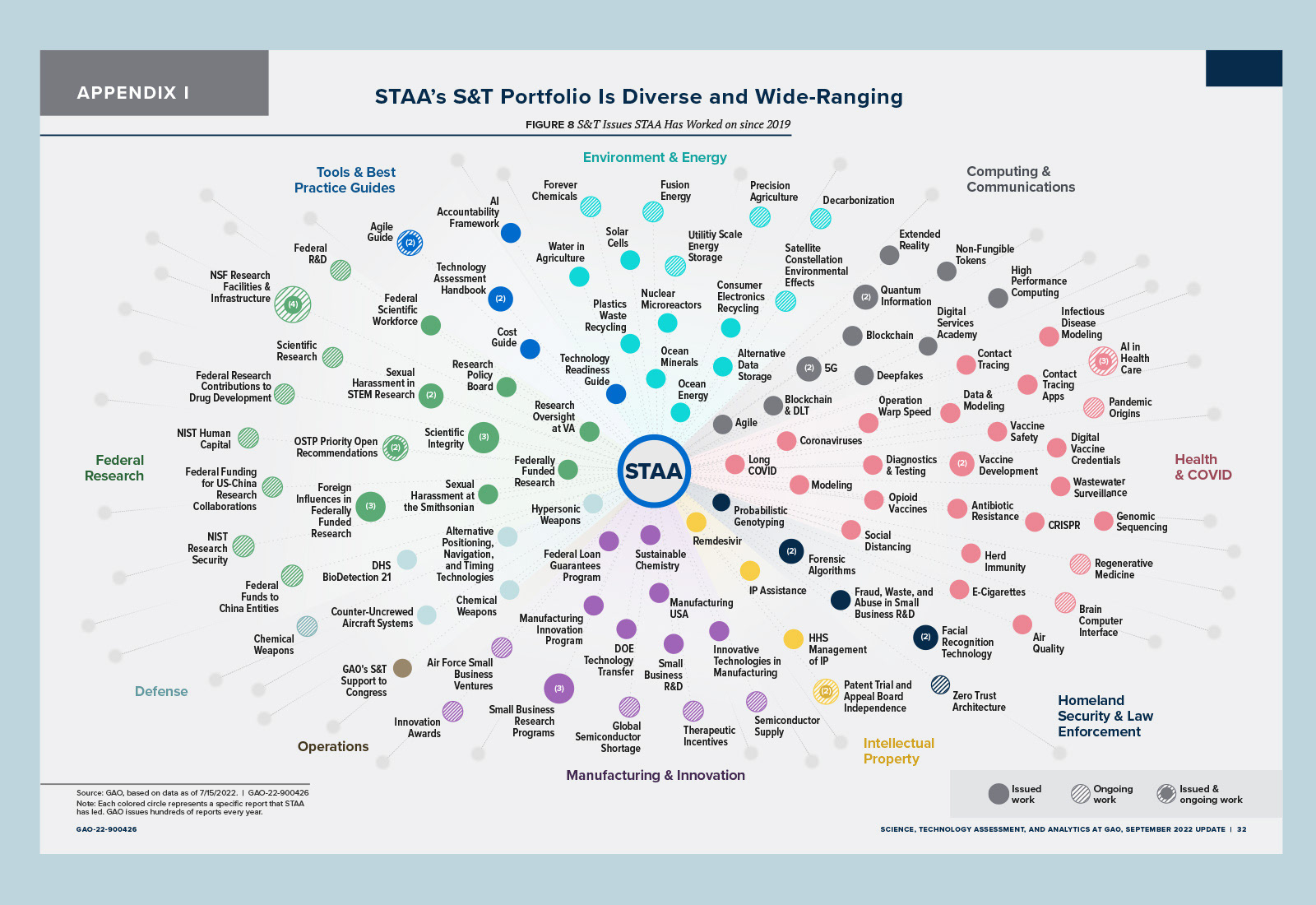
Visualizing STAA's Impact
I have also often been involved in helping visualizing the scope and impact of our team's work. These visualizations have been incorporated in numerous presentations and reports, including our Annual Update (above). Below is an example of this type of "impact diagram".
Reaching Out to Our Clients and Partners
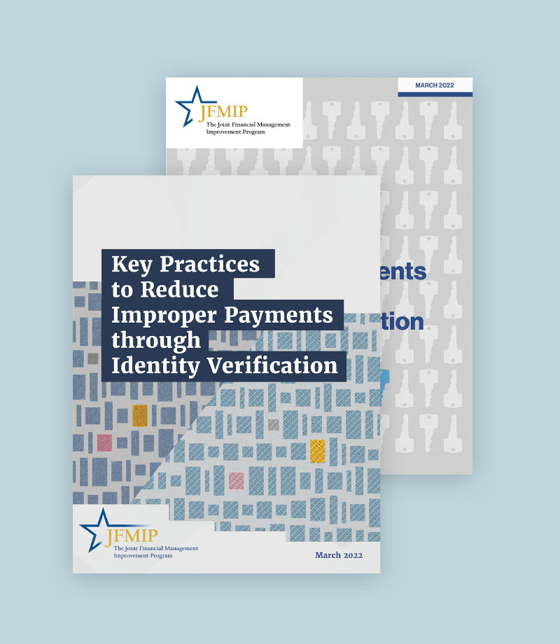
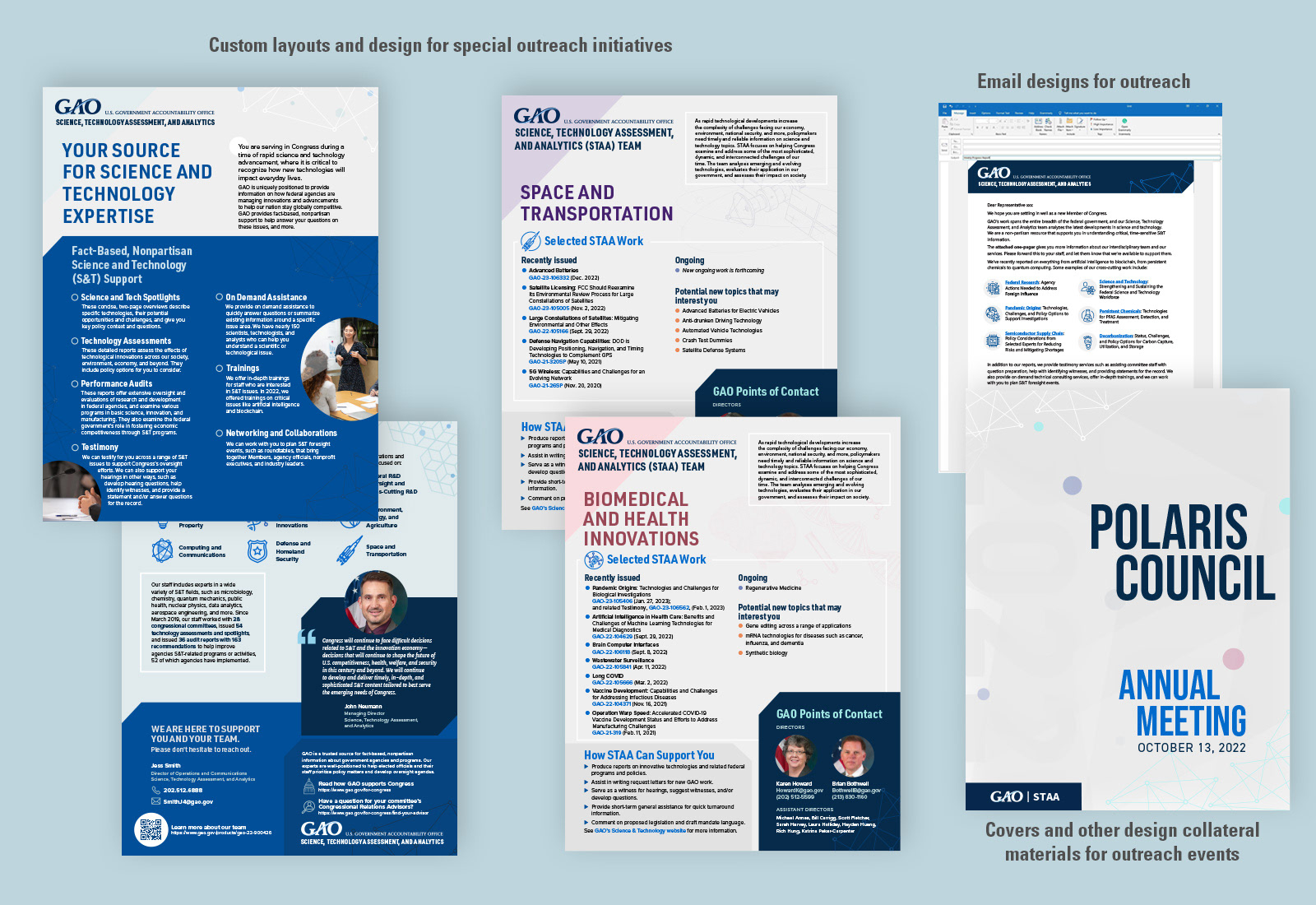
As someone who is passionate about strategic communication, I've also had the wonderful opportunity of working on materials and the strategy for reaching out to our Congressional clients and partner organizations. Below is sampling of some of this work. One element of this work has been to create a consistent visual identity for our team throughout.
Working Within Our Team and Beyond
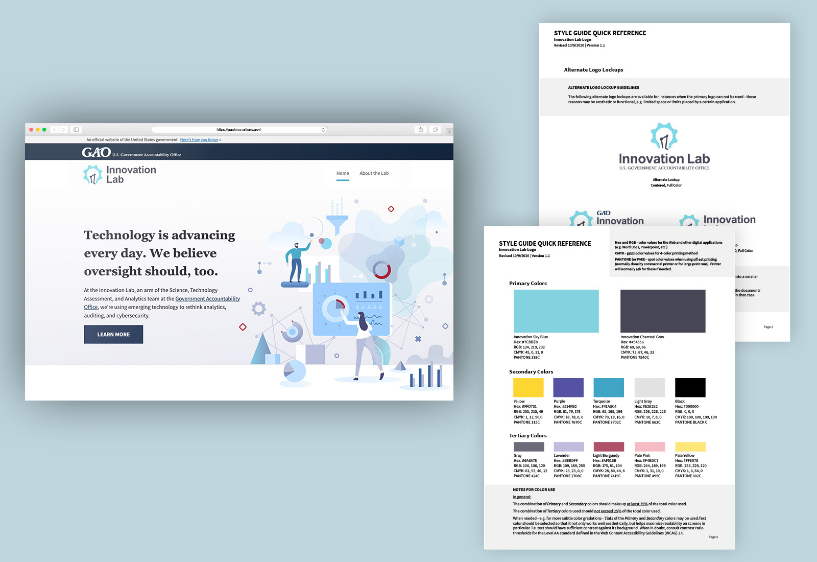
Innovation Lab
STAA is fortunate to have a group of highly talented and intelligent technologists, data scientists, and problem solvers called the Innovation Lab. I've had the privilege of collaborating with our Innovation Lab throughout the years on numerous projects - whether our Operation Warp Speed Dashboard website, data visualizations, offering UX/UI guidance and support for their prototype applications, the digital guides, etc.
I was also honored to design and develop their website and refreshed version of their logo and branding.
The Innovation Lab's website can be visited here.
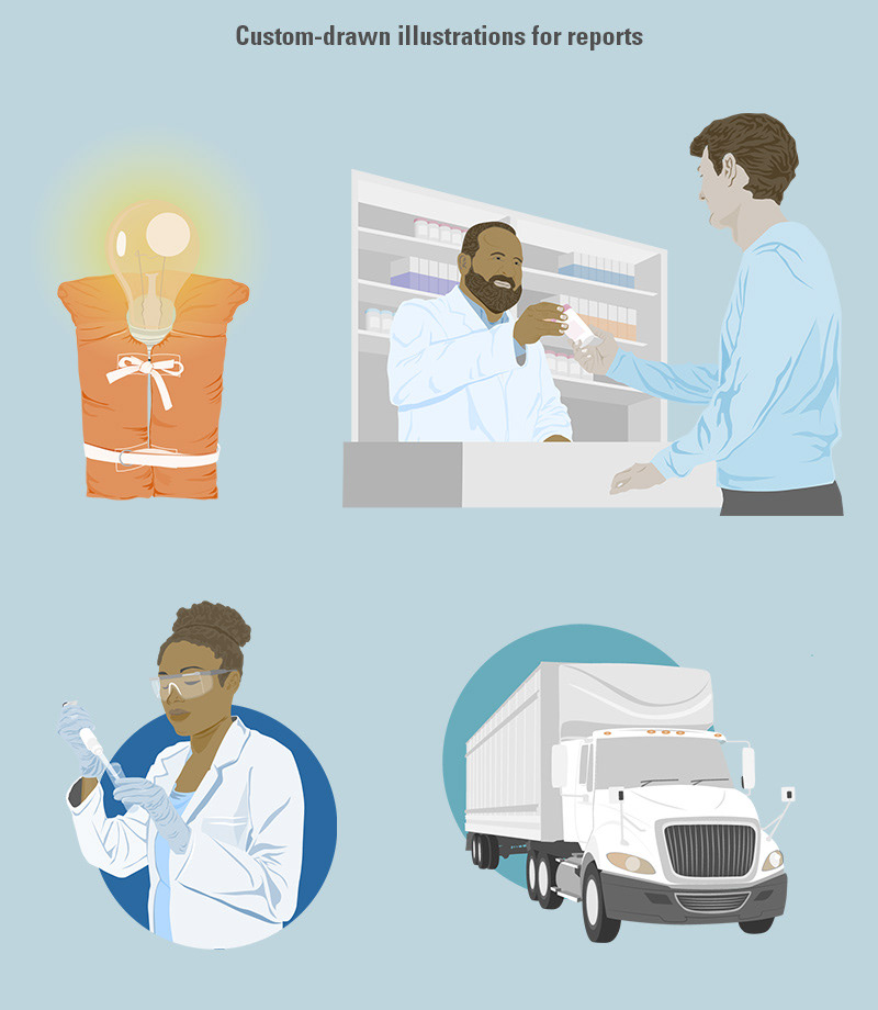
Working with Our Experts
One of the joys of my role with STAA is getting to learn about all manner of topics from some of the smartest people in the field. Helping communicate our team member's ideas visually is just plain fun. Below is just a small idea of some of the illustrative work I have been able to do while working with our teams.