
This was created for a teaching series that began at the start of the new year. We often begin the new year with hopes, dreams and aspirations that seem to inevitably dissipate over time. Where could we find the power to not only rekindle these hopes and dreams, but sustain them through out our life?
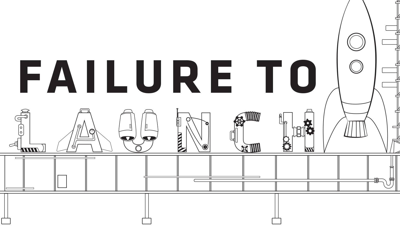
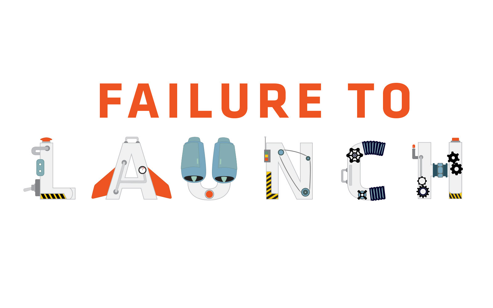
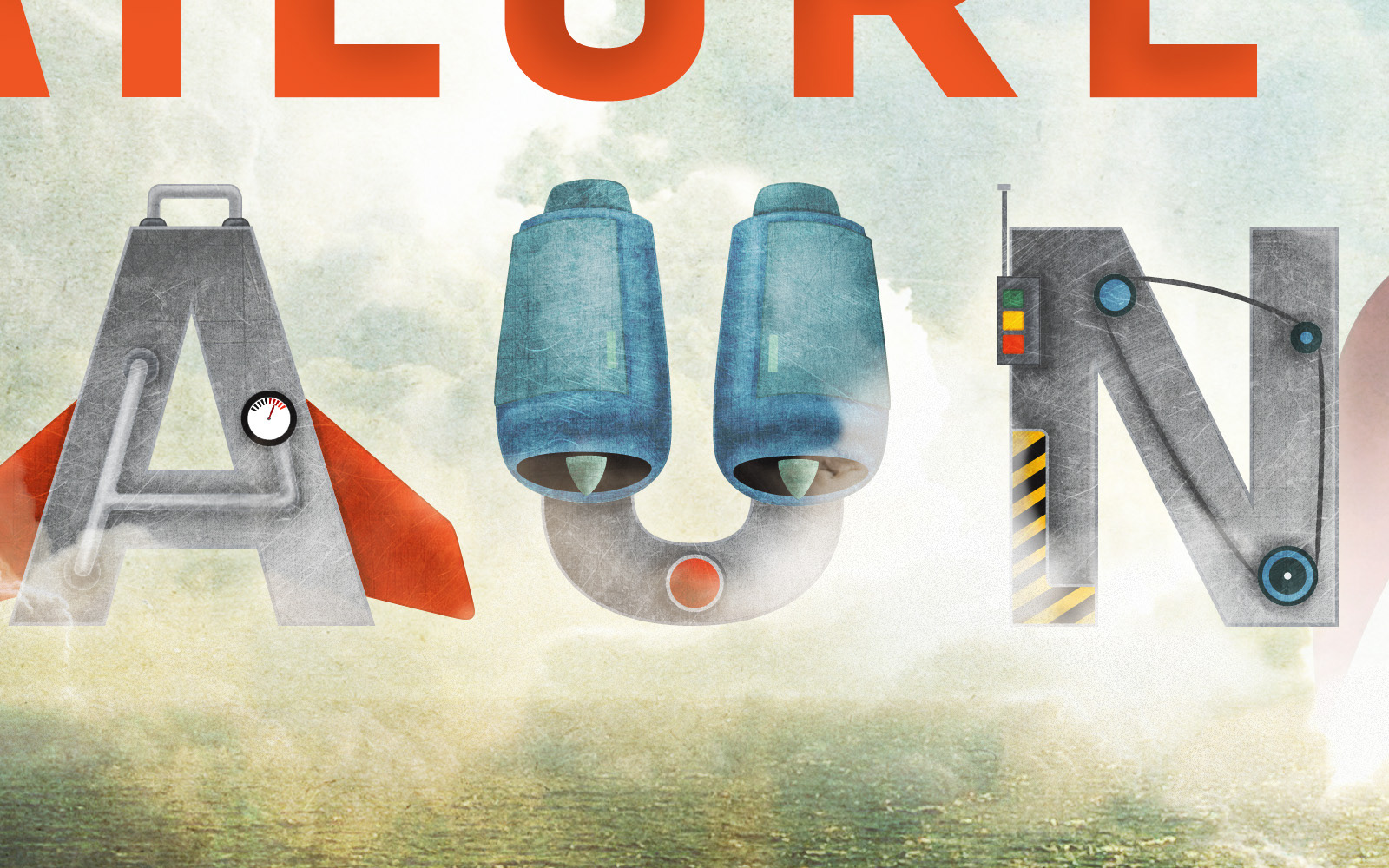
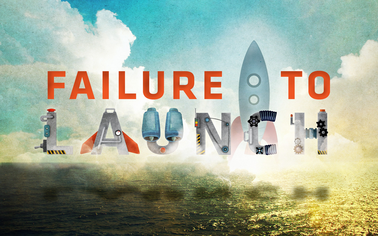
Klavika Bold was used as the primary typeface and basis for the letters in 'LAUNCH'. I initially considered setting the title on a launch pad, but opted to set it against the ocean sunrise because the letters launching above the ocean waters seemed to convey 'hope' just a little better. I went with a retro rocket that was a bit more cartoonish to keep the tone more child-like with respect to the way we dream and hope.
I was also able to build four large "Before I die..." walls base on Candy Chang's work, to go along with this series. People filled these walls with their personal dreams throughout the series, before they were assembled into one large wall on stage as a backdrop.
Drawn in Illustrator. Detail, texture, shading, and compositing in Photoshop.
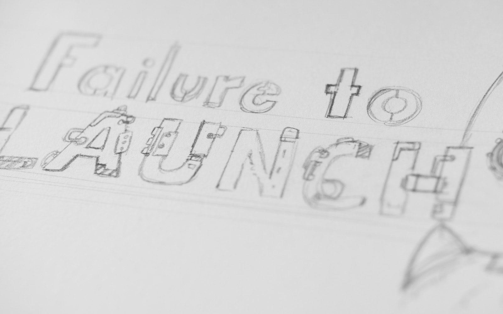
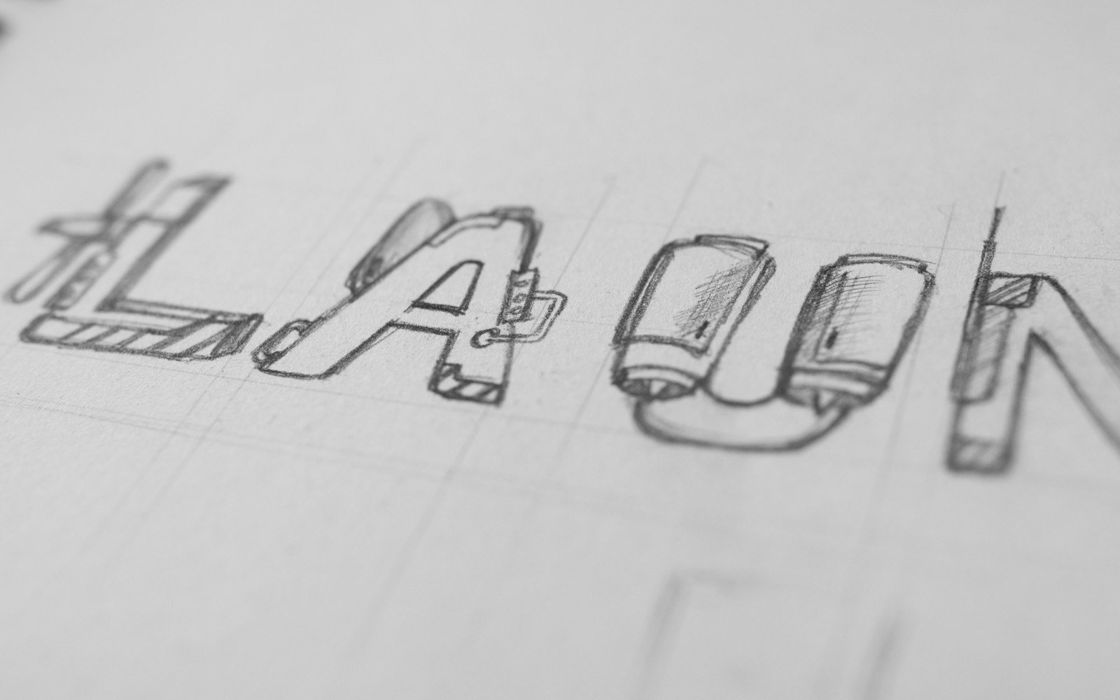
Some of my scratch work leading to the final product.